In 2015, Android is the most popular mobile operating system in existence. Figures from International Data Corporation show that Android eclipsed iOS in mid 2010, and by the end of 2014, the operating system owns about 81% of the market share, well ahead of iOS on 15%. The once-shy acquisition by Google is now the hottest property in the mobile marketplace, dominating the landscape in smartphones, tablets, and connected devices. It’s hard to look around and not see an Android-powered device somewhere, whether it’s a Samsung Galaxy-variety smartphone on the train, a tablet or convertible on someone’s desk, or, increasingly, wearables and smartwatches.
It wasn’t always like this.
Android started life (in the way we know it now) before Google acquired Android, Inc. in October 2003. At that time, Android, Inc. was run by Andy Rubin (who later joined Google) and his colleagues Rich Miner, Nick Sears, and Chris White. Their stated goal was to develop “smarter mobile devices that [were] more aware of [their] owner’s location and preferences”, but they did not have mobile phones in their sights. Android, Inc. was initially focused on digital cameras, but quickly realized that the market for smart digital cameras was not nearly ambitious enough.
SEE: 5 Best Android Rooting Software To Use Without PC & With PC
It’s important to recognize that at the time-around 2004 to 2005-mobile phones were not anything like their modern counterparts. Motorola had just released the (very popular) RAZR V3, and the earliest 3G handsets were starting to become increasingly popular. Motorola’s A1000 was one of the early 3G smart phones released in Australia, supporting web browsing, rudimentary applications, and a touchscreen interface. Nokia was still well transfixed with the (then) highly successful Symbian operating system, which could be found on an increasingly wide variety of “feature phones” that had powerful cameras, loudspeakers for music, or large screens for web browsing; but invariably, not all of these in one package. HTC was big in smart devices, producing a range of Windows Mobile devices that were hugely popular in business circles.
What the industry lacked was a cohesive feature set in one device. Inevitably, you could purchase a device that did one thing well, and a few other things not especially well. You could choose a smartphone with a big screen and poor software, decent software and a poorly performing camera, or a variety of handsets that really did nothing especially well.
There was also the “walled garden” effect; mobile was nothing like desktop computing. It was proprietary, limiting, and, for the most part, uncomfortable. People wanted (even expected) the same amount of flexibility and power on their mobiles that they had on their computers, but it just wasn’t happening.
same amount of flexibility and power on their mobiles that they had on their computers, but it just wasn’t happening.
Before too long, Android, Inc. switched goalposts and set about changing the mobile landscape forever. Not too much was known about their early work, but the company was not on the path to success. Andy Rubin ran out of money to fund the venture and needed assistance from friends. It was at this point, August 2005, that everything changed, as Google sat up and took notice.
As Google purchased the fledgling startup, Rubin, Miner, and White were to join Google, but little else was known. It was widely speculated that Google wanted to get into the mobile market, but at the time (oh, hindsight) it seemed somewhat fanciful.
It wasn’t until after the Google acquisition that Android reached its first significant milestone: the operating system that would later be known as Android was built, offering a mobile platform based on the open-source Linux kernel. Google began to pitch the premise to original equipment manufacturers (OEMs), but little was publicly revealed. At the same time, Apple was gearing up to release the first iPhone in 2007, and other phone manufacturers were blissfully releasing feature phones that weren’t built with “smart” in mind.
It wasn’t until November 2005 that the Open Handset Alliance (OHA) was formed, and a viable product was finally revealed to the world. Google had built the OHA, working with a consortium including HTC, Sony, and Samsung (who were not, at the time, particularly dominant in the mobile market) as well as chipset and other equipment manufacturers including Qualcomm, Texas Instruments, and a number of carrier partners.
Google took the wraps off the mobile platform it had been developing, revealing the first public version of Android based on the Linux kernel, on (at the time) unnamed hardware from an unspecified partner.
The first Android-powered hardware came from HTC (which had a bit of prowess in the early smartphone days), though the first device was not to go on to retail sale. The device resembled a hybrid of a Blackberry device (with a physical keyboard below a landscape colour display) and some of Samsung’s earlier Windows Mobile devices. Indeed, the unveiling of Apple’s iPhone in early 2007 saw that this early prototype would be quickly forgotten in lieu of a touchscreen device that would directly challenge Apple’s new market entrant.
With the iPhone, Apple had tapped into a goldmine, though it was the early days. Phones were no longer dominated by small screens and limited by poor user interfaces and (perhaps, most significantly) to accessing the whole of the Internet through a postage-stamp sized window. The first iPhone, with its big glorious screen and promises of a desktop-like browsing experience, set the market afire. Speculation was rife that Google (with its acquisition of Android) would release a “gPhone,” a Google competitor for the incumbent iPhone, but nothing could have been further from the truth.
DON’T MISS: Top 5 Android Apps For Church Lovers
Apple viewed the iPhone as the pinnacle of its development; it was an Apple product, designed to work with Apple services, allowing Apple to control the entirety of the user experience. Yes, the iPhone opened new doors, but it didn’t open Apple’s: you played within their rules, on their hardware, or you didn’t play at all.
Google was on to something completely different; it didn’t want to build hardware. It didn’t want to control the hardware. Android wasn’t an iPhone competitor. Android would power iPhone competitors from every major manufacturer. The iPhone wouldn’t have a Google phone to compete against, it would have many. They would be in different shapes, sizes, with different features, but united by a commonality: they would run Android, they would have tie-ins to Google’s services, but the platform would be open to everyone.
HTC quietly developed the phone that would be known as the “Dream” behind closed doors, unveiling the device in September 2008. The HTC Dream (aka the HTC G1) had both a touchscreen and physical keyboard, a trackball for pointer-type interaction, and a number of other features. Most importantly, it featured the first public release of Android, known simply as Android 1.0. This is where our journey begins.
Android 1.0
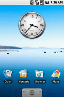 Android 1.0 was launched on 23 September 2008 alongside HTC’s Dream (aka G1). It was a very (and we do mean very) simplistic experience compared to Android in 2015; but many of the features that have become a core part of the operating system were well developed and in place then.
The basic features of a mobile phone were of course included: the ability to make and receive phone calls, send and receive text messages, store a phonebook and see the time, a calendar for time management, and basic apps for browsing the web and checking email.
Considering the early evolution of the platform, there were a surprising number of features built in that still feature as core parts of Android today. For example, the Android Market was present shortly after release in October 2008, allowing users to install
third-party applications. This contrasts significantly from the first iPhone, which did not have this ability. Equally, Android 1.0 had a powerful web browser that could render and display full web pages; color camera support; the ability to group home-screen icons in folders; and the ability to selectively display only the icons the user wanted on the homescreen, instead of every installed application like iOS.
Integration with Google’s developing (and already popular) personal information management suite was a given, with apps to support Google’s Gmail, Contacts, Calendar, Maps, Search, and Talk built in to the operating system.
Many features that iPhones would not have for quite some time were also present: the ability for apps to continue working in the background, a drop-down notification system, voice dialing, and custom wallpapers were a core function of Android from version 1.0, as well as support for 3G (which didn’t come until the second generation iPhone). Admittedly, Android 1.0 was released quite a number of months after Apple’s original iPhone, but Google wanted to achieve quite an impact with its entrant, and it did so.
Those who remember Android 1.0 on the original HTC Dream may not remember it especially fondly. It was certainly functional (and significantly more so than early iOS), but it was neither beautiful nor fast. It felt like a poor cousin compared to the well-established incumbent Windows Mobile, lacking polish and finesse. Early adopters wondered whether this Android thing would really take off.
Android 1.1
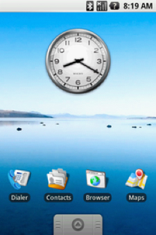 Android 1.1 was an update to the original Android release, which came about just shy of six months after the advent of the HTC Dream.
The update did not include significant changes to the original platform, though it resolved a number of bugs, changed how the Android API worked, and added a number of smaller features.
New features included displaying details and reviews for businesses in Google Maps, greater configurability of the dialer application, the ability to view and save attachments from email messages, and more flexibility in layouts available to third-party applications.
All in all, Android 1.1 was a minor update to Android 1.0, and quite a number of handsets released on the Android 1.0 platform never saw this update. It wasn’t until Android jumped to version 1.5 that
things started to accelerate and become significantly more interesting
Android 1.5 Cupcake
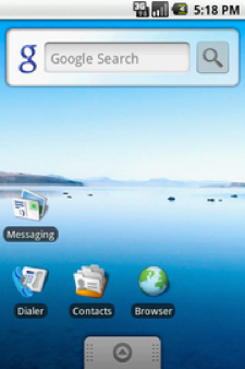 Android 1.5, code named “Cupcake,” was released just two months later, at the end of April 2009. It was significant both in terms of the version numbers-taking Android from version 1.1 to 1.5-and for the significant new features and functionality it enabled. It was also notable because it was the first time that an Android release took the name of a dessert, a feature that has stuck with Android ever since.
Some of the huge new features in Android 1.5 included support for third-party keyboards: you didn’t have to use what your device manufacturer thought worked or looked the best. Widgets became available, allowing you to further customize your home screen by showing weather, news, or more, rather than using only application icons. A feature missing on Apple’s iPhone, and much in demand, was the ability to highlight, copy, and paste text-something we take
for granted today.
Behind the scenes, other changes were made to improve the user experience: video recording on the device, support for an increasing variety of Bluetooth accessories, photos of contacts in the address book, screen rotation, improved call log functionality, better integration with Google services allowing video uploads to YouTube, and photo uploads to Picasa without needing a computer (basically unheard of at the time).
Cupcake was the release that early Android users clamored for. They wanted the improved features and there was much hubbub about how long the update would take to arrive on Australian handsets. Fortunately for us, it didn’t take too long, and we were enjoying all the Cupcake goodness alongside our friends in the U.S.
Five months later, the next version was already around the corner.
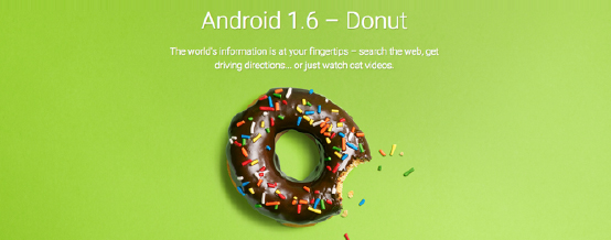
Android 1.6 Donut
Donut was more an evolution of Android Cupcake than a significant update in its own right; new features were not standouts, but they did improve the usability of the growing platform.
Users could search their devices using voice or text, and results included Google search results from the Internet. On-device results including phone book entries and content from various app developers were made visible to the search. Camera and Gallery support were improved, making the camera faster to launch, and the Gallery offered new features for viewing and manipulating images.
Behind the scenes, and importantly for the platform, the Android Market was further developed, allowing users to see screenshots of apps before installing them and to search for apps without
support was also further developed to bring faster Internet speeds to Android devices. needing to resort to third-party utilities.
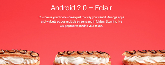
Android 2.0 Eclair
Android 2.0, Eclair, was launched alongside Google’s first foray into developing its own branded handset, rather than relying on third-party manufacturers to develop their own.
Google’s Nexus One (developed as a white-label device for Google by HTC) was to welcome the dawn of Google’s Nexus program, created with the goal of showcasing what Android could do-on a device that would set the pace for Android and hardware development. Initially available only in the United States, the Nexus One quickly spread around the world officially and unofficially, and it remains (to this day) one of the best examples of what Android could do way back when.
It wasn’t just a spectacular hardware release that made Android Eclair so important; the operating system was significantly changed from Android 1.6, Donut, with many, many new (and welcome) features. These included the ability to sync Android with
more than one account (allowing many email accounts on one device); support for Microsoft Exchange; the ability to search even more on-device content (including SMS, emails, and more); an improved on-screen keyboard, which offered spelling corrections and contact suggestions; an all-new web browser with greater support for modern standards; a new calendar layout for personal information management; and, of course, many behind-the-scenes changes for developers as well.
The pace refused to let off, with Android 2.0.1 and 2.1 released in December 2009 and January 2010, respectively, which primarily addressed bugs and other behind-the-scenes improvements.
Android 2.1 Eclair
It was with Android 2.1, Eclair, that Samsung launched its (soon to be trendsetter) Galaxy S line of smartphones in June 2010. The handset would go on to become an international best-seller, with upwards of 24 million devices sold by the end of its run in January 2013.
It wasn’t until Android jumped to version 2.2 that we saw a new dessert in the mix, with (yet again) more significant feature inclusions and improvements.
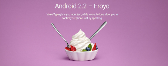
Android 2.2, Froyo, was released in May 2010, roughly six months after Android 2.0, Eclair, and set a good schedule for regular updates to the Android operating system that has continued to date.
Froyo did not launch alongside a new Nexus handset; rather, the existing (and ever-successful) Nexus One was quickly upgraded to support the new software. We wouldn’t see another Nexus phone until the end of the year.
Significant features in Froyo were the inclusion of push notifications, which allowed apps and services to receive updates from the Internet without needing to be active (or even open). Receiving notifications from Twitter and email became possible, and quickly welcomed in a new era of connectivity. Further, the ability to use an Android handset as a portable Internet WiFi hotspot came about, which was quickly restricted by carriers who had offered (at that point) unlimited Internet usage plans because there were practical usage limits imposed by the hardware and software limitations.
Froyo did not bring a significantly different visual appearance from Eclair, which it replaced; but, behind the scenes, just about everything was changing. The Browser application was updated with new Javascript support; Microsoft Exchange support was widened to integrate better with enterprise environments; the Android Market was improved with batch and automatic updates; support for Flash animations and animated GIF files was built in; and bigger, brighter new displays were on the cards with support for 720p displays up to 4″ built into the platform.
Android 2.2 saw a number of minor releases-2.2.1, 2.2.2, and 2.2.3-which did not significantly alter the user experience, save for improving the performance of the operating system and fixing some bugs that had hindered the first Froyo releases.
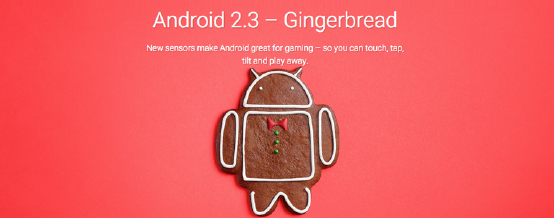
Gingerbread arrived in December 2010, and the trend of more rapidly changing user interface design continued; though the most significant was yet to come. Gingerbread remained the platform version for almost a full 12 months, as development was about to take a leftward turn.
Gingerbread came alongside a newly announced Nexus phone, and it became clear that Google would release a reference device along (most) new versions of Android for the times to come. Samsung produced this next installment of the Nexus program, in the form of the Samsung Nexus S, which built on the success of its emerging Samsung Galaxy S line of handsets. The Nexus S retained much of the innards of Samsung’s own Galaxy S, with some newer features specifically for the Nexus brand. It wasn’t exactly a popular handset, but it did see releases direct from some carriers on subsidized plans, which certainly pointed to the increased adoption of Android as a platform.
Gingerbread made a number of its own changes, including significantly improving the interface speed and simplicity. Support for even higher-resolution screens was included, as well as improvements to text input accuracy copy and paste functionality, support for other technologies like Near Field Communication (or NFC), improved web-browser protocols and video performance, and a more unified way to access files and email attachments downloaded on the phone.
Gingerbread saw a number of improvements over the following 12 months, but none of them was especially remarkable, with the updates including the standard bug fixes and improvements.
While Gingerbread held the fort in the mobile phone space, Android was about to fork into a new update that left mobiles behind. Android 3.0, Honeycomb-exclusively for tablets-was around the corner, and it represented a monumental shift in Android as a whole.
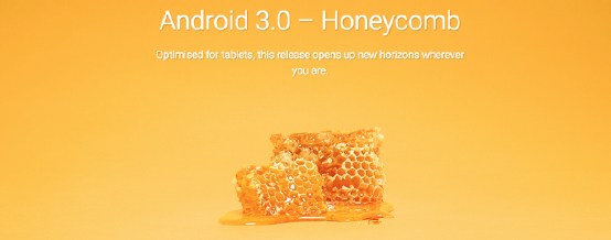
Android 3.0 Honeycomb
Honeycomb was a new version of Android, with a twist. It wasn’t a new version of Android for smartphones-it was designed purely as a tablet-based experience. To many, Android Honeycomb was a bit of an eyesore compared to previous generations of Android, and it marked the first significant, complete re-imagination of the Android visual experience. It brought with it one of Google’s most daring design languages, known as Holo design, for its use of holographic user interface elements.
Google didn’t release a reference device or Nexus device alongside Honeycomb, in a break with its growing tradition; rather, it worked with Motorola to release the Motorola Xoom, the first tablet to run the operating system. The Xoom was not well received; and as tablets go, it was a fairly ordinary device-it didn’t compete well with the incumbent (and wildly successful) Apple iPad. However, Honeycomb was the show stealer, and it wasn’t hard to see why.
Among the many, many changes that Honeycomb brought in was the addition of an on-screen system bar (which, until then, had been exclusively the domain of hardware keys on Android devices). No longer did an Android device require any physical keys to interact with, as volume, back, home, and switching apps could be done using on-screen soft keys. The system bar wasn’t the only user interface tweak by any measure, with the Action Bar making its first appearance, which remains in a slightly different form, in Android today. It offered contextual options, navigation, and interaction with different kinds of content displayed by the active application.
Multitasking had also been improved (given the demand for this feature on tablet devices), offering a much closer experience to that already found on desktop computers with thumbnails of active apps so you could quickly find the app you were after.
A number of features behind the scenes included support for multi-core processors, which though rare at the time, are now commonplace; improved permissions and restrictions for apps to protect user data against malicious interference; improved browsing, camera, and gallery applications; and easier-to-use contacts, calendar, and email applications designed specifically for tablets.
Those who used the first generation of Android tablets almost always remember being somewhat disappointed. We were already a bit jealous of what Apple was doing with its successful iPad line, and we expected Android to keep up. It didn’t, really, and Honeycomb was widely considered to be a bit of a flop-early Android on tablets was slow, rigid, and devoid of many apps, with developers still focusing exclusively on smartphone applications instead of tablets. Indeed, using third-party applications on Honeycomb devices was universally disappointing, leading many (including this writer) to leave Android tablets behind for the better supported iPad platform.
Android 3.0, Honeycomb, saw a number of point releases through version 3.1, 3.2, and through to 3.2.6 without significant new features but improvements to the initial (somewhat poor) experience. By the time Honeycomb had reached version 3.2.6, it wasn’t great, but it had improved significantly. This reflects something that Android has always embraced, and that’s fast growth and improvement.
It was Android 3.0, Honeycomb that also first graced our lounge rooms in the earliest forms of Google TV. While this platform was far from enjoyable (it suffered various issues adding up to a fairly hit-or-miss experience) and eventually flopped, it sewed the seed of a much greater product to come a couple of years later.
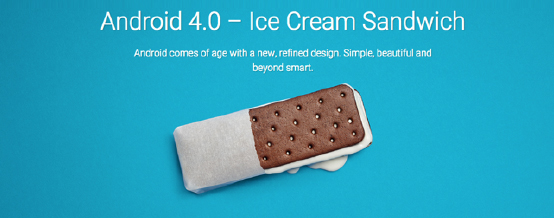
Android 4.0 Ice Scream Sandwich
Ice Cream Sandwich (which quickly became known as ICS) represented a huge leap forward in October 2011 for so many reasons. First, it was the first version of Android to use the newer Linux 3.0 kernel. It also brought Android back together, with unified smartphone and tablet support in the same major build number. A significant number of Honeycomb elements came across to the unified experience, including much of the Holo interface, a new default system font specifically designed for mobile, and soft buttons for phones to replace those awful hardware keys (though many phones have kept these to date).
ICS was heralded in by the next Nexus handset, Samsung’s Galaxy Nexus. Built somewhere in between the Samsung Galaxy S II and S III, the Galaxy Nexus was considered successful; it paired strong hardware with a maturing operating system, and it saw commercial success.
ICS also brought a number of new user features that had been in demand, including a visual voicemail interface (which Apple had already released); improved user interface features, such as easier creation of folders using drag and drop; improved text entry; copy and paste; and voice control. The move to integrate Google Chrome with Android also began in earnest; and while web browser would remain a part of the open-source Android experience for at least the next 12 months, it quickly fell from practical use when Google Chrome hit the mobile market in September 2012.
Users also gained finer-grained control over their devices with the ability to close background applications and to share information with others over NFC, Bluetooth, and WiFi direct. Support for VPNs finally became official, no longer requiring unauthorized modifications of the operating system to achieve.
ICS was updated in December 2011 and March 2012, without significant new features. There was one significant change in March 2012, though it was more of a branding exercise than a significant change of features-Google renamed the Android Market, which had existed since 2008, to Google Play, and, in doing so, it unified a number of previous services. The new Google Play Store allowed users to download apps, music, movies, TV shows, books, and more under one branded experience.
Android 4.1 Jelly Bean
As much of an improvement over Android Gingerbread that ICS was, Jelly Bean was over ICS. Announced at Google I/O in June 2012 and released shortly thereafter, the most significant improvement was the inclusion of Google’s “Project Butter,” which aimed to forever rid Android of the user interface quirks and lags of the previous iterations. To achieve this, Android anticipated touch interactions, triple-buffered the user interface queues, and implemented a 60-frame-per-second frame rate to make the user experience, “buttery smooth.” Jelly Bean achieved this goal, though by the time it was implemented by many third-party hardware manufacturers, much of the performance increase had been lost.
Besides this visual change, Jelly Bean didn’t include as many new features as some earlier releases had. Of course, many things were improved and changed, but in terms of strictly new features, there weren’t all that many. Expandable notifications arrived, as did more granular control of those notifications, alongside improved connectivity options. It wasn’t until Android updated to version 4.2 (while retaining the Jelly Bean moniker) that we saw some significant new features.
Jelly Bean 4.1 was released alongside a smaller form-factor tablet from ASUS, called the Nexus 7. While the original device proved a little thick for some tastes, it was generally well regarded so much so that ASUS released an updated Nexus 7 model (dubbed the Nexus 7 2013) 12 months later, which was even more popular.
Android 4.2 Jelly Bean
With that point increase in November 2012, Android 4.2 arrived with a Linux 3.4.0 kernel, supporting lock-screen widgets and swiping to open the camera without unlocking the handset. Quick settings first appeared, allowing common settings to be changed with little more than a swipe down, such as enabling or disabling WiFi, Bluetooth, screen brightness, WiFi hotspot, and more. Bluetooth support was significantly changed (with the underlying software library changed from Bluez to Broadcom open source software), which enabled far greater accessory support.
Alongside Android 4.2 came Google’s next Nexus handset, this time from another Korean manufacturer, LG. The Nexus 4 supported many new features including wireless charging, which would start to become more mainstream in the years ahead.
Alongside the Nexus 4, Google launched two other Nexus devices to cover all segments of the Android market: a cellular-capable Nexus 7 from ASUS, and the Nexus 10, a 10″ full-frame tablet manufactured by Samsung. Both devices have been kept current (at the time of writing) with the latest versions of Android, and they are also notable because they saw significant sales via bricks-and-mortar retail channels rather than purely online sales.
The experience across phones and tablets was further unified, with the same design language applying to both, with centralized on-screen soft keys, system bar, and home-screen with dock appearing on both platforms. A number of bugs were also fixed, as had become the norm, but on the whole the second iteration of Jelly Bean was one of the most widely anticipated and well received.
In March 2013, Android’s founder Andy Rubin left Google’s mobile division to work on new projects. His departure was notable, as he had been with the project from the very beginning; and to many people, Rubin’s was the face of Android. Rubin’s replacement, Sundar Pichai, came from within Google; he had already successfully managed Google’s Chrome and ChromeOS projects, and was to add Android to his repertoire. Though some were initially skeptical of how Android and Chrome could be managed together, there are a lot of synergies between the products, and Android has grown ever bigger and better under Pichai since.
Android 4.3 Jelly Bean
In July 2013, Jelly Bean was updated again to Android 4.3, again retaining the Jelly Bean label. The update included new support for Bluetooth devices including the new “low energy” specification to save battery life, support for restricted user profiles (for those who let their kids use their tablets!), improved file system support and performance, and support for bigger screens with higher resolutions.
Alongside the Jelly Bean 4.3 release came the next Nexus 7 from ASUS, which has stood the test of time; it remains one of the most popular Android tablets available on the market.
By third quarter 2013, though, Jelly Bean was starting to show its age, and many were wondering when the next update would arrive, with rumors of “Android K” floating around for months without any real news from Google.
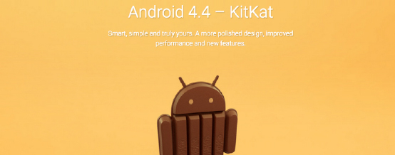
Android 4.4 represented another huge leap forward, despite only being a minor point release change from Android 4.3 before it. It also represented a significant departure from the previous names given to Android versions. KitKat is not the name of a generic dessert, rather it is a trademarked property owned by Nestle, and licensed by Google for the use of the Android program. Alongside the launch of Android KitKat was a cross-promotion with Android-branded KitKat bars on sale in a number of markets, with competitions and giveaways thrown in as well. It was an interesting experiment, and it worked very well for both brands.
Android KitKat debuted with the Nexus 5 in October 2013, and it was an almost instant success. It was sold widely, outright, and through carrier subsidized contracts, and became a shining example of how KitKat could work and feel. Intended as a reference device only, the Nexus 5 was a significant commercial success, and it remains a popular handset even today.
The core of Android had been shrunk down and streamlined significantly, increasing further the perceived performance of Android over the already impressive “Project Butter” changes. Paired with the increase in performance was a vast improvement in design language, with the Holo interface officially being toned back before it would later be replaced. Applications also gained the ability to alter the system user interface as needed, for example, making the system and action bars translucent, or making them disappear altogether for a full-screen immersive experience.
One of Android’s selling points-the ability to use Micro SD cards-was significantly restricted in Android 4.4, KitKat, reducing their utility to basically media storage (photos, videos, and music). Many core Android functions were abstracted, allowing better third-party integration-one of the best examples of this was with SMS storage, which allowed the user to nominate a default SMS application, which then took over all Android SMS functionality.
A significant change was under the hood, but it was still in development with KitKat and not ready for public use; the change from the Dalvik runtime to the Android Runtime that would see significant performance increases. It was eventually enabled by default in Android 5.0, Lollipop.
KitKat saw a number of point releases (through 4.4.1 to 4.4.4), which mainly covered bug fixes, and with 4.4.4, a significant SSL vulnerability was quickly patched (though because OEMs often customized Android before releasing it, they weren’t able to quickly take advantage of the 4.4.4 SSL fix).
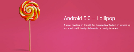
Android 5.0 Lollipop
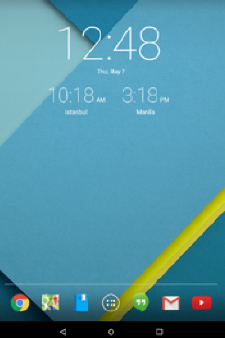 Android Lollipop had long been an open beta (in the form of Android L) when it saw release in November 2014. The trademarked name had gone (reverting back to a generic name), but then again, the branded codename wasn’t the only thing missing. Lollipop changed the whole game.
The public beta of Android L sped the development of updates by OEMs, meaning that many (but not most) modern handsets were able to offer an update to Android 5.0 rather quickly, with many updated by first quarter 2015.
Launched alongside the latest Nexus handset, the Nexus 6 from Motorola, Android Lollipop featured perhaps the most significant overhaul of Android’s user interface yet. If Holo was groundbreaking over the previous Android interface, than Android Lollipop’s Material design was light years ahead.
The responsive design ensured that it was very easy for developers to release clean, sharp apps that worked equally well on phones and tablets without significant compatibility issues.
Lollipop also heralded changes to the way notifications work (which caused some controversy at the time); and perhaps most significantly of all the changes was the final switch from Dalvik VM to ART. Dalvik, a core component of Android since its first release, was a typical Java-based runtime, which offered just-in-time (JIT) compilation and byte-code interpretation -basically, this means that the code was interpreted and compiled on the fly. Good for cross-platform operation, but lacking in performance.
ART on the other hand offered ahead-of-time compilation (typically at the time of install) and enhanced memory management, meaning that apps (once installed and compiled into machine-code) load with the same speed as other machine-language compiled applications, at the minor inconvenience of installs taking ever-so-slightly longer than with Dalvik VM.
Android Lollipop also (if that wasn’t enough) brought in support for 64-bit processors, streamlined core processes to increase battery life (or reduce power consumption), and presented general improvements to increase overall performance. It’s probably fair to say that Android Lollipop was the single biggest change since Android was released, and hand-in-hand with that was a mixed reception; lots of users love Lollipop, but many miss some of the features that it did away with or changed from prior releases.
Android Lollipop was not flawless; at the time of release it had a significant memory leak bug, which degraded performance on some devices and rendered others basically useless. The HTC-built Nexus 9, released to showcase Lollipop, suffered so significantly that the tablet’s reception was almost completely negative.
Android 5.1 Lollipop
At the time of writing, Android 5.1.1, Lollipop, is the latest release, and it fixes the memory leak bug that plagued the two earlier variants of Lollipop. It didn’t introduce any significant new features, but it did roll-back some of the changes that had been rather unpopular in Android 5.0, including the inconsistent handling of notifications and sound/vibrate/silent modes.
It has yet to be released for the majority of devices, running only on the later releases of Google’s Nexus line. Early indications are that Android 5.1.1 continues the evolution of the Android user experience, offering faster user interface speed and smoother overall interaction.
Android Today
As it stands today, Android is one of the most versatile and widely used mobile platforms in existence. It runs on three different chipset architectures-ARM, Intel / x86, and MIPS- in both 32- and 64-bit variants. Minimum hardware requirements have increased in line with the availability of newer technology, such that today, Android requires 2GB of RAM at a minimum to operate at a reasonable speed; though some devices do operate with 1GB of RAM (with smaller overheads).
On-board storage has increased immensely, from the HTC Dream’s measly 256MB of storage space, through to modern devices, which can feature up to 128GB of on board storage (more than a 500x increase).
Capabilities have increased by many orders of magnitude, from basic phone functions with smart features thrown in, through to full-blown mobile computing platforms with phone features kept in for good measure. Android is now featured on many devices, from smartphones to tablets, computers to watches, music players to car stereos, and the list continues to grow, with Android’s foray into home entertainment and video gaming just taking off.
Google’s Play Store has more than 1.43 million active applications as at the start of 2015, and more than 50 billion application instances have been downloaded and installed by Android users.
It’s little wonder that Android is the most popular mobile operating system on the planet. The leaps and bounds it has covered in the six years since its major public release in April 2009 are greater than anyone could have imagined. With this in mind, we can only guess as to where Android might be in another six years, and whether it will bear any resemblance to its appearance today. [Udemy]
Special thanks to Chris Rowland of Ausdroid Media Pty Ltd. for contributing this piece.
Hot:









2 Comments
KENSHI
wooow! This is a page to keep.
ejeta benjamin
download games and app for free all for mobile on
http://www.kikguru.com/toxicwap-download/