Nothing has got me really fulfilled playing with my Android Smartphone. I have had apps and deleted in almost equal succession and I don’t really get upbeat when any app is hyped like the world was coming to an end in 2012 as predicted by the Mayan calendar. I have literally been disappointed by promises a lot of app developers make which later turn out to be a shameful let down.
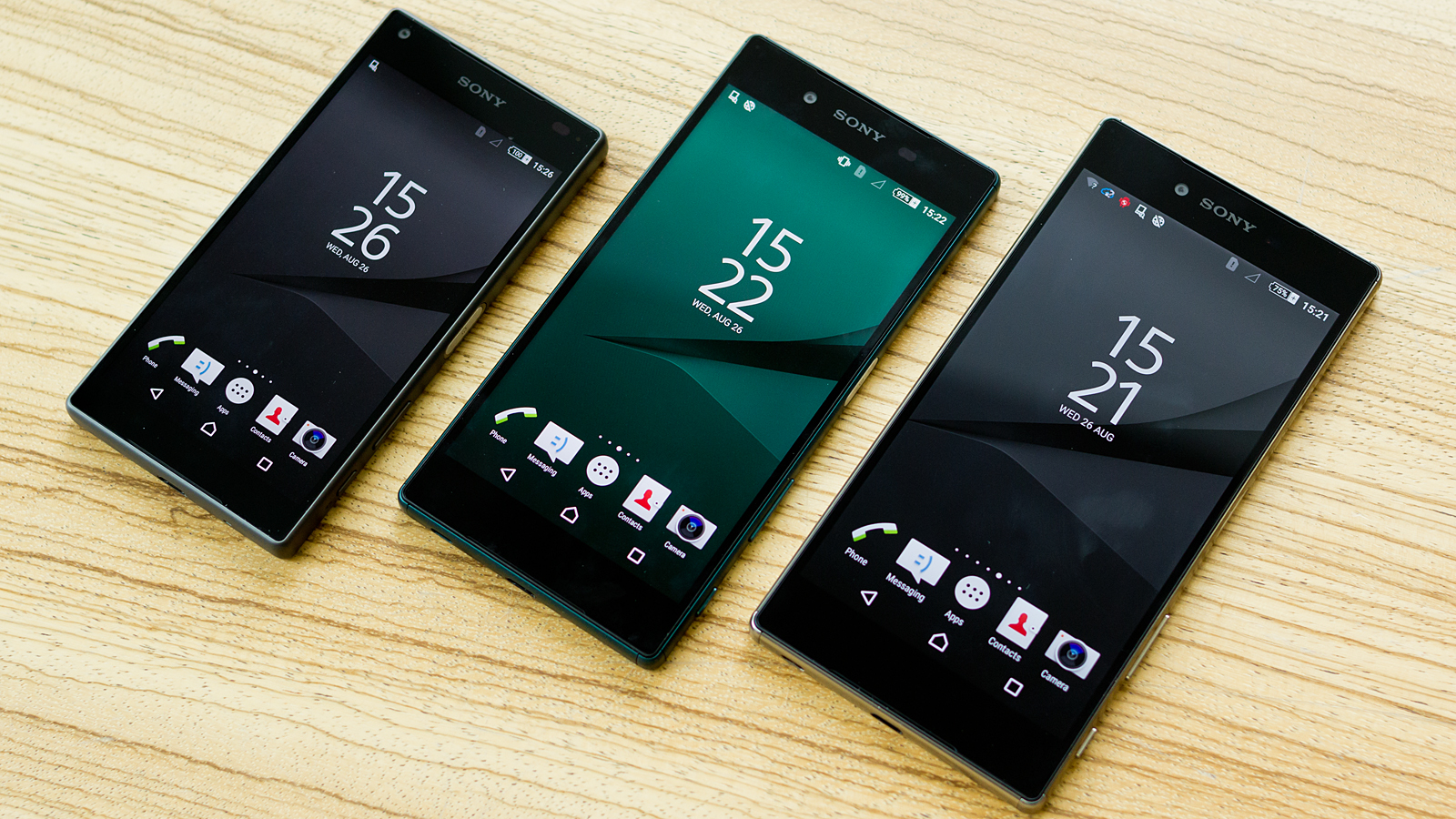
In skepticism, I decided to try out Aviate in full knowledge that it would replace my Xperia home screen which I spent a good number of days customizing. Naturally, users have to adapt to the home screen like I did with my Xperia smartphone instead of it adapting to us. This of course, is the reason why I can’t call Aviate just an app, rather it qualifies as a “smart app,” that simplifies your smartphone without your help.
Home screen Like Never Before
Installing the app for the first time with take you to several options where you have to accept permissions to make Aviate work like a charm. Within seconds, you are greeted with an ever intuitive home screen and you might notice a huge sign of relief almost immediately.
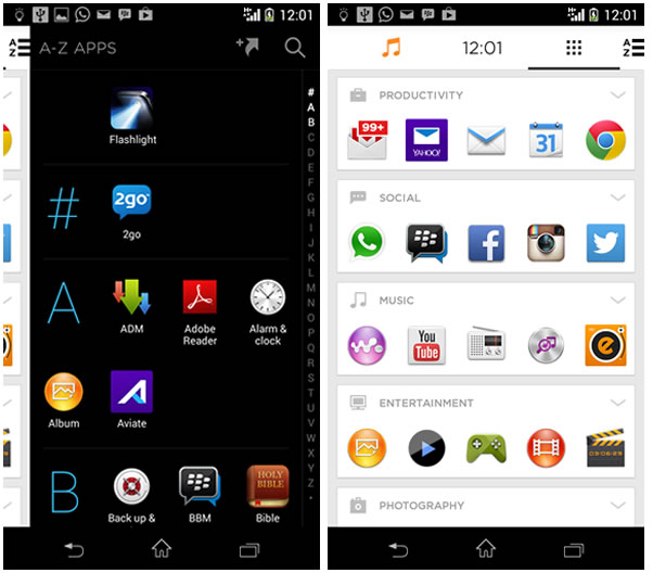
Instead of having a bunch of blank home screens and customizing same every time, Aviate dramatically changes how we interact with our smartphones. A simple tap on the home button would reveal the main screen, which comes by default with a large image as well as five app icons carefully arranged at the bottom of the screen. Swiping to the right reveals a collection of your most used apps, also neatly organized in collection – Productivity, Social, Music, Entertainment and Productivity etc. Each of these special collection have an arrow icon on the upper right corner you can tap to reveal “apps not frequently” used.
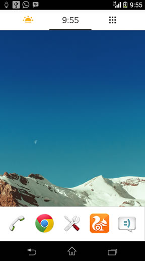
If you swipe even further to the right, you get to see pure awesomeness. All of your apps are arranged in alphabetical order. You see everything in one spot and you never need to crack your brain looking for where a particular app is located.
Aviate Spaces
This is ultimately where Aviate set itself apart. It relies on a profile system which allows Aviate to give you access to relevant apps and information with a simple tap of the home button or the arrow in the upper right corner. These profiles (including Time, Home, Moving, Nearby, Work, and Going Somewhere etc) can be selected manually from a slide-out menu, but they will also activate automatically based on your location or movement. The Time profile, for instance, switches from “Morning Routine” to a normal daytime profile to “Night Time” as the day progresses.
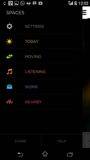
Aviate profiles are incredible. The “Today” profile gives you quick access to alarm, weather as well as today’s global news. Navigating to the “Going Somewhere” profile provides shortcuts to Maps, Foursquare, and other relevant apps you have installed. I have a Work and Moving profile and you can guess what they do individually. The “Work” profile quickly takes you to your productivity app drawer and you can also add widget or collection to make it more intuitive.
Continuous usage of Aviate will make the app understand a user’s pattern and can then begin to recommend apps for download.
Final Thoughts
Aviate may not be app for everyone, since many people would still love to go traditional by customizing their home screen themselves. If you love simplicity and want to interact with your phone like never before, then having Aviate do the job would be a worthwhile decision.
| Likes | Dislikes |
| Slick and smooth UI | Android 4.0+ support |
| App suggestions | iOS (N/A) |
| Apps in Alphabetical view | Windows Phone (N/A) |
| No blank home screens |
Aviate is definitely more than an app and when Yahoo said they plan to take control our home screen with the “smart app,” I wasn’t really moved. However, my thoughts have changed and six days using Aviate has already proved to be the best and only alternative for my home screen. I also recently installed the app on my Xperia tablet Z and this should tell you how so fast Aviate was able to dramatically alter my thought pattern.
Review Overview
Hot:
